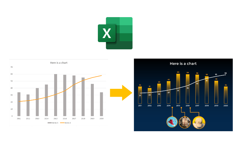
Everyone needs to know how to make their Excel charts look pretty.
It is not just aesthetic — it’s about getting your story across better, creating more impact with your data, and removing the distractions.
So here is how you can make minimalist and modern-looking charts like a graphic designer in Microsoft Excel. These tips will tell you what Excel features to use to make your charts look unique and minimalist. Note that I’m using Microsoft Office 365, the latest version as of writing of this post.
Clean it up
Make your chart before going through this tutorial. If you need a detailed process of how to make charts, you can watch this video or read this article. You can search for other sources as well.
After making your chart, clean it up. Remove all the distractions and all elements that don’t add value to your charts.
- Delete legends.
- Delete gridlines.
- Delete axis labels (for column and line charts).
Then add or adjust elements to make the chart easier to read.
- Add data labels.
- Adjust gap width (for column charts).

Apply a color palette
Colors make a huge difference in making beautiful charts. But using the default Excel colors is boring.
For amateurs like me, you can use color palette generator websites (I suggest: coolors.co or paletton.com). Once you have generated a palette that you like, copy the hex codes onto Excel so you can use it later.
To apply a color on the chart:
- Click on the element (ex. background, columns, lines) to change its color.
- Go to the
Formattab. Click the small arrow icon on the lower left ofShape Stylessection. This opens theFormat Task Paneon the right of the window. - On the
Format Task Pane, go to theBucketicon. - Use the
FillorBordersettings to apply the colors you want. - To add colors from the palette generator, in the color picker, click
More... Color> Click theCustomTab> Paste the 6-character code on theHex Codetext box.


Add fancy graphics
Graphics can add more context to your charts and deliver a clearer story of your data. If you have images in mind that you want to add to your charts, here is how to do it better in Excel.
While your chart is selected, insert your images or shapes. It is important to select the chart while adding objects. This automatically binds the image or shape to the chart, making it easier the chart around.
You can then crop the image into a circle, add boarders, and add lines to your chart.

Summary
- Remove chart elements that do not add value to your chart, like gridlines, legends, and axis labels. But add data labels when necessary.
- The Format Task Pane is your friend. It has a lot of settings you can play with to achieve your design. Use it to your heart’s desire.
- A unique color palette makes a lot of difference. Use color palette generators, and copy hex codes onto the custom color picker to apply to your charts.
- Keep the chart selected while adding an image or shape to your chart, so it is automatically grouped together.
There you have it. Say goodbye to your boring charts, and make a great impression on your next presentation.
If you need additional help or more details on any of the steps here, feel free to comment, and I’ll try my best to respond.

Leave a comment